Every time a new AI image generation model comes out, there is a wave of people creating new content riffs inspired by their friends testing out the newest capabilities.
Yesterday OpenAI released ChatGPT Images 2.0 which is tool powered by the gpt-image-2 model designed as a “visual thought partner.
It is pretty fun to play with if you have even the slightest design or visual vocabulary to work with. Or even just a couple cool selfies.
No need to focus on regulatory capture politicking, compute shortages, geopolitical drama or shipping choke points when you can create cute social media content right? Screw a grey zone informational wars (or even a hot kinetic one) girls just want to be remade as a fairy princess science or as Studio Ghibli character.
So what’s the next trend? My feed produced a wave of mood boards with color theory, swatching, fabric pins, makeup stories, hairstyles, other mood board elements that combines everything from descriptive prose to capsule wardrobes. And all this from a a couple of basic uploaded photos and some simple prompts.
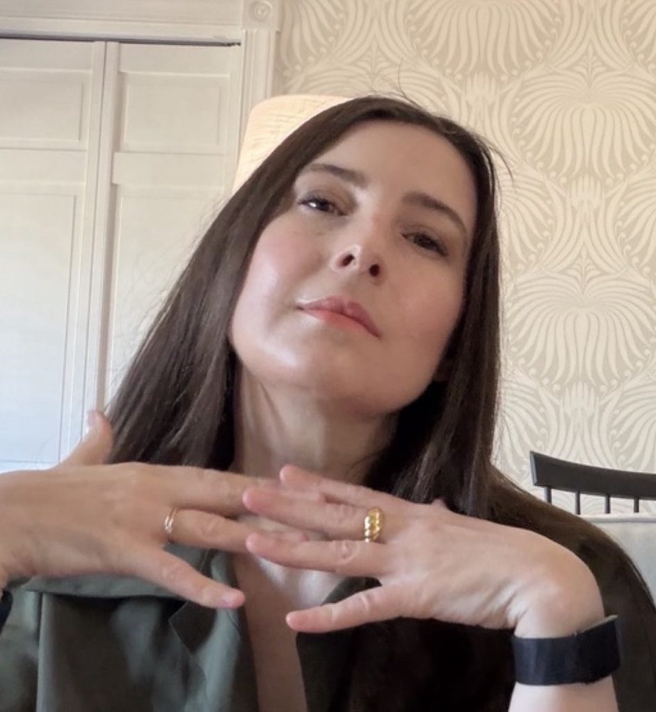
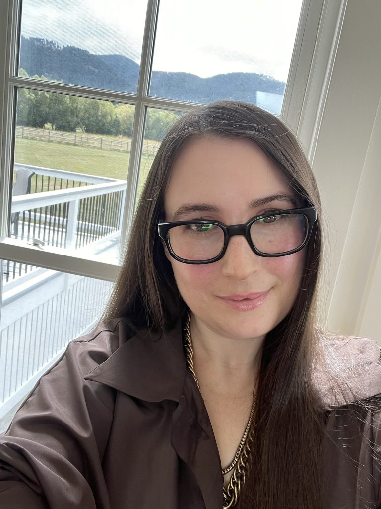
I choose the below images and said “do a color analysis of the woman in this picture including best colors, makeup choices, hair choices, style options and create a mood board with outfit inspiration, prints that work, accessories and other details”
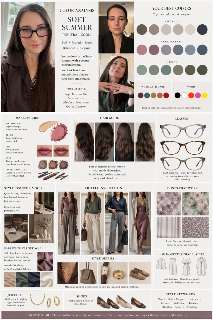
From there it spat out a long analysis which I will post below. I then asked that analysis to be mocked up in a mood board based on the look and feel of the images with the descriptions from the analysis. And I’m not going to lie it’s pretty good and clearly ChatGPT can smell the Ann Taylor on me. I mean, umm, it can tell I spent time working for some of best known American heritage retailers.
Now it gets weirder the more you try to edit it. The slow warping of my face from my own to I’m going to say Sheryl Sandberg is a little unsettling. But I do wear a lot of silks and prefer greens and browns though I am often a little black dress defaulter.
Now I just went through an enormous exercise in which I tried to find a television and camera ready foundation where other models were sure I was a soft autumn but a soft summer isn’t all that far off.
And I appreciate the buttering up OpenAI does with their quiet luxury spiel. I’m more of an Italic luxury buyer and a Quince if I’m feeling like a gamble. But somewhere back before all this inflation I for sure was the kind of girl who wore chunky antique vermeil accessories and never turned down a nice olive green.
This is a great set of photos for analysis—different lighting, styling, and contrast levels make it much easier to see your natural coloring clearly.
🎨 Overall Color Season: Soft Summer (leaning Neutral-Cool)
You sit in that refined, muted, slightly cool palette with:
- Low-to-medium contrast (your features blend rather than sharply contrast)
- Soft, diffused coloring (nothing overly bright or high-chroma)
- Neutral-cool undertone (pink in the skin, but not icy)
You can borrow slightly from Soft Autumn (especially olive/green tones), but your best looks are cooler and more muted.
🌈 Best Colors for You
✅ Core Palette (your power zone)
- Dusty rose, muted mauve
- Soft plum, blackberry
- Blue-gray, slate, steel blue
- Sage, eucalyptus, muted olive
- Taupe, mushroom, cool beige
- Soft navy (not inky or harsh)
⚠️ Approach Carefully
- True black (can feel a bit heavy—your blazer photo shows this slightly)
- Bright white (too stark—soft ivory is better)
- Bright jewel tones (too high contrast)
🚫 Avoid
- Neon anything
- Super warm oranges/yellows
- High-contrast combos (black + white, etc.)
💄 Makeup Direction
You look significantly more harmonious in the softer, diffused look (photo 1 and 3 vs the sharper blazer look).
Skin
- Light to medium coverage with a natural or satin finish
- Avoid overly matte—your skin looks best with a bit of life
Blush
- Rose
- Soft berry
- Muted pink (what you’re wearing in photo 1 = excellent)
Lips (this is your strongest feature zone)
- Rose gloss (photo 1 = perfect)
- Mauve nude
- Sheer berry stains
- Avoid: orange-red or overly brown lipsticks
Eyes
- Taupe, mushroom, soft plum
- Cool brown instead of warm bronze
- Soft liner (charcoal > black)
- Mascara: brown-black ideal
💇♀️ Hair Analysis
Your natural coloring works beautifully—this is key.
Best Hair Direction
- Neutral to cool brown
- Slight ash or soft cocoa tones
- Subtle dimension (very blended, not high contrast)
Avoid
- Golden highlights (too warm)
- Very dark/black dye (overpowers you)
- High-contrast balayage
Styling Note
You shine with:
- Soft movement
- Natural texture
- Slightly undone polish
👓 Glasses (important win here)
The black frames:
- Add structure (good)
- But slightly overpower your softness
Try:
- Soft charcoal
- Translucent gray
- Muted tortoiseshell (cool-toned)
👗 Style Essence + Mood
You read as:
Soft Minimalist + Intellectual Romantic
(very understated, very intentional, very modern)
Think:
- Quiet luxury
- Slightly academic
- Soft structure, not rigid tailoring
🧥 Outfit Direction
Silhouettes
- Fluid tailoring
- Draped fabrics
- Soft blazers (less sharp shoulders)
- Relaxed but intentional lines
Fabrics
- Silk
- Fine knits
- Matte satin
- Soft wool
- Avoid stiff, shiny synthetics
🧵 Best Neutrals (your wardrobe backbone)
- Mushroom
- Cool taupe
- Soft navy
- Dusty olive
- Muted charcoal (instead of black)
🌿 Prints That Work
Because your coloring is soft, your prints should be too:
✅ Ideal
- Blurred florals
- Watercolor patterns
- тонal (low contrast) stripes
- Soft geometrics
🚫 Avoid
- High-contrast graphic prints
- Sharp black/white patterns
- Loud, busy designs
📌 What Your Photos Show (Specific Feedback)
Photo 1 (window light, glasses)
Best overall look
- Soft pink lip = perfect
- Brown shirt = harmonious
- Natural light = confirms your muted palette
Photo 2 (black blazer)
- Black is wearing you slightly
- More contrast than your features naturally support
- Makeup slightly sharper → less aligned with your softness
Photo 3 (relaxed, green tone)
- Muted green = excellent
- Skin looks balanced and even
- This palette direction is very “you”
🧭 Style Keywords (use these when shopping)
- Muted
- Soft
- Washed
- Dusty
- Neutral-cool
- Blended
- Understated