The more power we seem to gain working with large language models, the more apparent it is that few of us are visually literate in a meaningful way. When you hear talk about design, it is all too often moods and vibes with no specifics.
Now, you might say that you know what you like when you see it. That’s also how we let the Supreme Court talk about porn. Clearly untangling the weft and weave of taste (and by extension culture) can be further articulated rather than relying on subjective, non-definitional standards.
How you came to your visual reference preference set is quite a bit more complicated than whatever pre-digested piece of media came across your algorithmic feed.
You can explore design languages from one token to the next, but visual literacy involves a lot more than scrolling or confirming you’d like to see more content “like this.”
When I first began circulating in design circles in the early aughts, the hipster set was obsessed with Edward Tufte and his now classic Visual Display of Quantitative Information.
Edward Tufte taught data analysis and public policy as a professor at Princeton and Yale for 31 years.
Tufte, via his Graphics Press, wrote, designed, and self-published 5 books on analytical thinking and showing, taught a one-day course, Presenting Data and Information for 923 days to 328,001 students.
Who knew Tufte and I both shared a love of marking the days of our work? He influenced many more people than I have but I find some joy in that coincidence.
His most referenced work, which I mentioned above was published in 2001. Visual Display of Quantitative Information was on the desks of everyone designer I knew, from fashion and Silicon Valley to public policy it was a mainstay. The man knew how to lay out information visually and he became the standard.
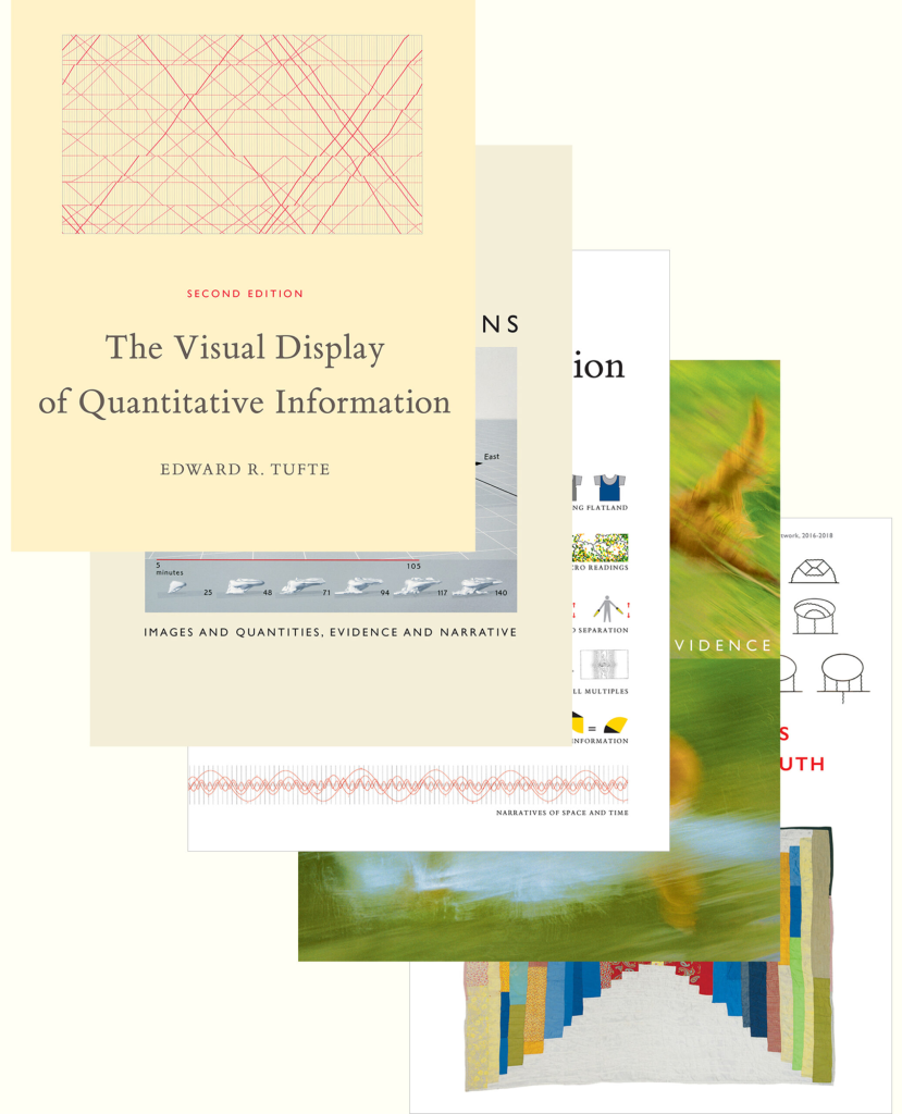
The long tail of enthusiasm for displaying data beautifully surely owes its ubiquity in some part due to his success in teaching my generation’s designers.
He’s became for a period so universally referenced that Tufte became a cliche. Now he’s classic a quarter century later. His work arguably as successful as a visual language reference anchor as bookshelf favorite, “The Design of Everyday Things” by Donald Norman. His work is also denigrated as cliche in some circles.
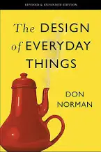
Both men offered clarity and practical principles over taste and theory. Those academic predecessors befuddled many who experienced aesthetics primarily through semiotics and critical theory. It felt revolutionary to return to form and function
You “Kant” really learn to love the languages of aesthetics from theory alone as it turns out. I’ll place a little AI synopsis to make the connection clear. This is from Perplexity:
Someone might relate to the popularity of Edward Tufte and The Design of Everyday Things as part of a broader hunger for clarity over clutter in how information and objects are presented.
Tufte’s work is influential because it treats visual design as a serious vehicle for understanding data, while Norman’s book argues that everyday things should be intuitive, legible, and centered on the user.
A Tufte-style chart removes decoration so the trend is easy to read, while a Norman-style kettle shows clearly how to fill it and pour it without guessing.
Both are forms of respect for the user: one respects the reader’s attention, the other respects the user’s actions.
Learning how to use an item or a tool, or how to interpret charts or graphics, can easily overwhelm anyone and feel disrespectful to students. A whole era of computing was stuck between the power of the command line and the legibility of the desktop metaphor.
Norman spoke of the Gulf of Execution as the gap between a user’s goal and the means to execute that goal. Tufte similarly wished to remove the confusion in charts and graphs so one’s ability to glean information wasn’t stuck in a gulf of understanding thanks to overwrought bar chart or sankey diagram.
With new artificial intelligence tools we are bridging some of that gap, not with design but with raw computing power. We are moving beyond the CLI and the desk and into a world of reference and inference.
I just hope we all take the time to learn our reference set so we can do more than say “I know it when I see it” as that will be our only way across the gulf of execution. Some things never change. Learning the languages of your field is one of them.